Thoughts by Caleb Warren
(No other townies are to blame for this content)
This blog usually reviews music, but I spend a lot more time reviewing articles on consumer research, which is the study of why people buy crap and why it typically doesn’t make them any happier. Yesterday, I submitted my 300th report as a reviewer, associate editor, or area editor (see below).

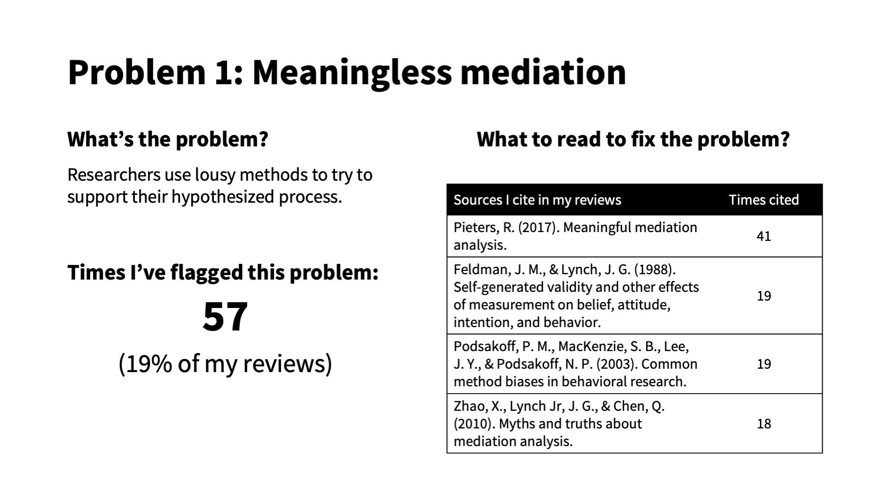
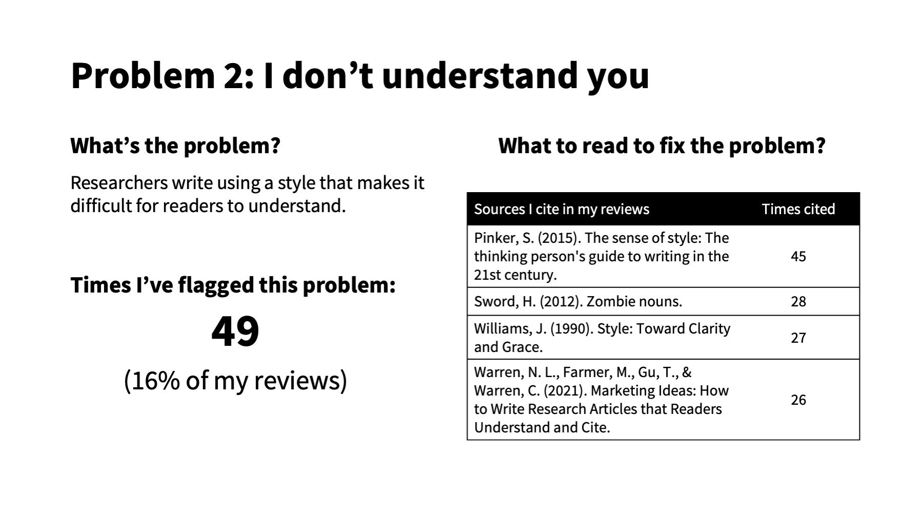
I notice the same four issues in the papers that I review. This post is a rant about these problems and an homage to the research that explains how to fix them. If you were hoping for thoughts on Ethel Cain’s new record, try Pitchfork. But if you want to improve your chance of publishing a paper when you land someone like me as a reviewer or AE, keep reading.
Consumer researchers, like philosophers and toddlers, are obsessed with the question, “Why?” It’s a worthy question, but ask it too often and you’ll get to an answer like “because I said so” or “it’s turtles all the way down.”
In lieu of turtles, consumer researchers turn to mediation.
Example…
Suppose that I discover that online retailers sell more stuff when they display a “designed by humans” badge on their website, like this:

I run three field experiments showing that websites sell more furniture (study 1), cosmetics (study 2), and artwork (study 3) when they display this badge than when they don’t. My studies show a consistent significant main effect of displaying a “designed by humans” badge (p < .001), but they don’t tell me why the badge increases sales.
So, I create a new experiment to test the “process.” I get my AI research assistant to fabricate two versions of a clothing website:
Online survey takers view one version of the website and report their attitude towards the brand (a proxy for sales), the extent to which they see it as warm, and the extent to which they anthropomorphize it:

When I get the data, I run a mediation test using Model 4 in Process (Hayes) with the “Made by Humans” badge manipulation as the independent variable, warmth as the mediating variable, and attitude as the dependent variable:

I find that participants think that the website is warmer (A-path) and consequently like it more (B-path) when it has a “Made by Humans” badge. The confidence interval for the indirect effect (A x B) does not include zero, which indicates significant mediation. I run a similar test swapping the anthropomorphism measure in place of warmth; anthropomorphism also mediates, but its indirect effect is smaller, so I conclude that the effect is driven more by warmth than anthropomorphism.
I’m tickled pink because I have an answer when reviewers ask, “what is your process?” My process, Reviewer 2 sir, is that including a “made-by-humans” badge makes people like the brand because it boosts warmth.
Why my evidence is weak
There are at least three reasons why my process evidence is shaky, if not completely meaningless (see Pieters 2017).
One, I don’t know what’s causing what. Mediation tests measure both the mediator (warmth) and dependent variable (attitude); they thus test correlations, but not if one variable causes the other. I could be swapping the cause and effect. For instance, maybe the “designed by humans” badge makes participants more likely to buy cosmetics, and they infer that the website is warm because they (intend to) buy from it. There could also be a different, unmeasured variable that explains the effects on both the mediator and the DV. Maybe the “designed by humans” badge makes participants feel better about themselves for patronizing a website that supports human labor, and this warm self-glow causes them to perceive the website as warm and to want to purchase something from it.
Two, the mediator is the same as the dependent variable. Explaining that people like the brand because they think it is warm is about as helpful as your doctor telling you that you’re tired because of “fatigue” or explaining that your dumpster is on fire “because it’s flammable.” These explanations are not wrong, but they don’t tell you anything that you don’t already know.
Three, taking similar measures back-to-back leads to common method bias and mere measurement effects (also called self-generated validity). Common method bias happens when things appear to be more related than they are because we measure them the same way—using seven-point agree-disagree scales, for instance. Mere measurement effects occur when measuring one thing changes how people respond to other things. Suppose I run a survey that asks, “what is your opinion of platypuses?” And then, “What are you thinking about right now?” I find that respondents are more likely to say that they are thinking about platypuses than other animals, including dogs, cats, birds, and fish. Should I declare, “People think about platypuses more than dogs”? Of course not. Respondents were thinking about platypuses because I asked about platypuses in the previous question. Similarly, asking whether participants “like” a brand will change how they answer other questions about the brand, including whether they think the brand is warm and human-like, and this bias will be even larger because I used the same scales for each measure.
How can you Fix this problem?
The easiest fix is to stop trying to explain the process. Many papers contribute by illustrating what happens or when it happens rather than explaining why it happens. Suppose that you discover incontrovertible evidence that eating Pop Tarts makes people live longer. Should you delay submitting your findings because you’re not sure why Pop Tarts extend life?
Not if you want people to live longer.
Likewise, should I not submit my research because I don’t know why the “designed by humans” badge boosts sales?
Not if I know that the badge can meaningfully boost sales.
Sadly, editors and reviewers in marketing act as if they don’t care for sales, human life, or whatever other implications stem from the effects we discover unless we can also “explain the process.”
When, however, explaining a process is how your research contributes, then you need to show stronger process evidence. To do this, first ensure that your process explanation is conceptually distinct from effect itself. Don’t merely describe the effect using different words. Second, measure the process and dependent variable using different methods, and ideally at different times. Third, move beyond correlational mediation tests either by manipulating the mediator to show that it causally influences the dependent variable (i.e., the causal chain approach) or by using the process to predict—and then test—when the effect will get bigger and when it will disappear (i.e., process-by-moderation; see Spencer, Zanna, and Fong 2005).
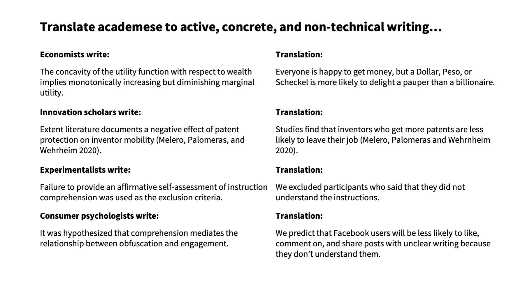
Academic writing is too technical, passive, and abstract. Here’s the “Designed by Humans” badge research described in academese: Humanization signification enhances firm performance at the level of sales. Or, consider this gem from philosopher Arthur Schopenhauer: Abstract rational knowledge is the reflex of the representation from perception.
How can you fix this problem?
1. Replace jargon with non-technical language.
Researchers sometimes need technical language to concisely or precisely communicate a procedure or method, like ANOVA or negative binomial regression. But most of the time, simpler words clarify writing without adding length or sacrificing precision. Changing heterogeneous to different, elucidate to clarify, or explicate to explain, will make your writing easier to understand without being any more longwinded or less precise. Likewise changing humanization signification to showing that humans were involved and abstract rational knowledge to understanding the world would begin to make these academic sentences clearer.
2. Tell readers who’s kicking whom.
The second fix is to put the action back in your sentences by describing who does what to whom. Consumer research is about how people learn, decide, spend, use, dispose, and do other stuff in the marketplace. Yet, we often disguise these actions and who’s performing them with zombie nouns, like disposal, humanization, signification, performance, and other lifeless abstractions that tend to end with ity, tion, ance, ness, or ism. You can bring your sentences back to life by transforming zombie nouns back into active verbs and telling readers who’s doing what to whom. Instead of humanization signification enhances firm performance, write, firms perform better when they signal that they use humans. Instead of the representation from perception write people interpret the world from their senses.
3. Use concrete metaphors and examples.
The third fix is to be concrete. The challenge is that scholars write about abstract concepts, such as brand experience, satisfaction, and consumption. Yet readers perceive and learn about the world through concrete experiences that they can see, feel, taste, smell, and hear, like a brick building, grease fire, or puddle of melted ice cream. You can help readers understand abstractions like negative experience and dissatisfaction by using concrete examples and metaphors. To illustrate dissatisfaction, for instance, you could describe a customer, we’ll call her Madison, who thumb-types a one-star review into the Yelp app on her Google Pixel after a zit-faced waiter spills NitroBrew on her Balenciaga crocs. Similarly, my hypothetical research would be easier to understand if I were to specify that signaling using humans means displaying a “designed by humans” badge.
By removing the technical, passive, and abstract writing, I can make my writing understandable: Consumers are more likely to buy from retailers when the retailer says that their products were “designed by humans.”
Here are a few other examples...
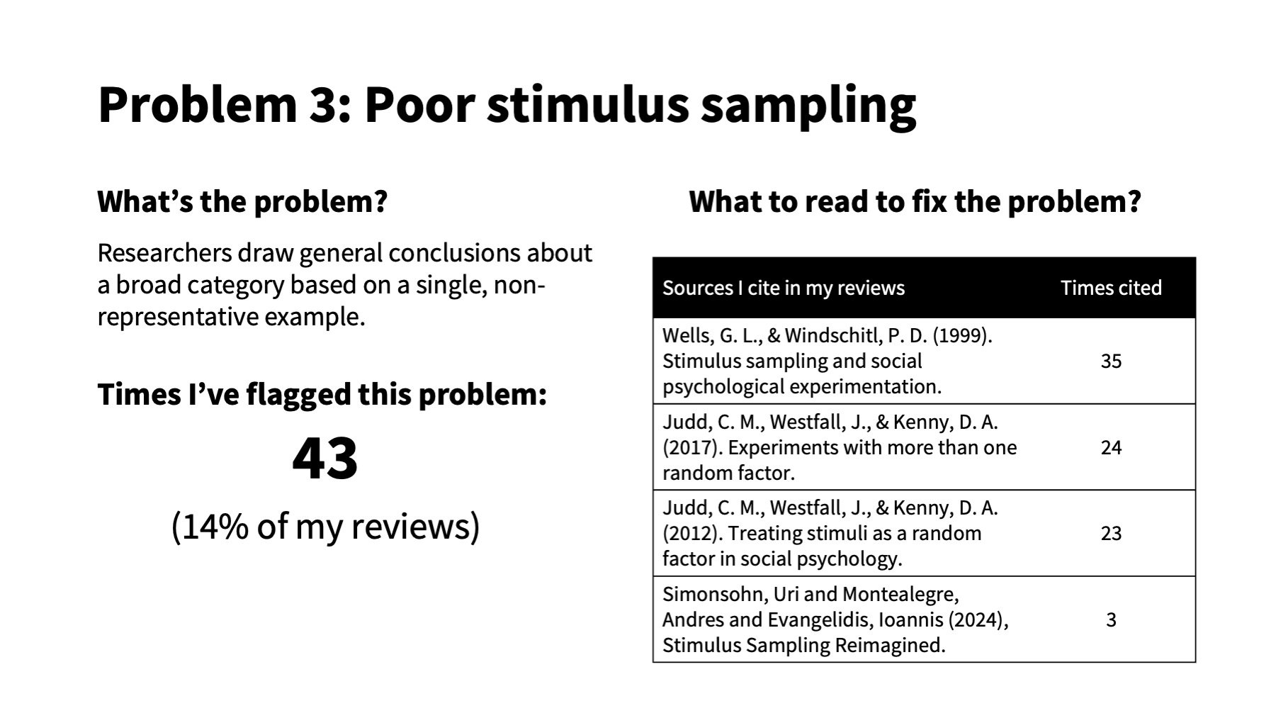
A single stimulus can’t represent an entire category any more than a potato can represent all food, the Taco Bell chihuahua can represent all dogs, or Jeffrey Dahmer can represent all Wisconsinites. Yet, consumer research experiments regularly try to generalize results from experiments that use a single stimulus.
Let’s return to my “designed by humans” research, in which my experiments all manipulated whether a website displays this badge:

I conclude: Consumers are more likely to buy from websites that display a “Designed by Humans” badge.
But would my results hold if the websites displayed a different “Designed by Humans” badge? What if they used this one?

Hopefully not.
The rub with social science is that we seek general knowledge, but we observe only specific examples. “Designed by Humans” badge is narrower than most constructs in consumer research, yet badge designs could vary in font, color, Hitler-presence, and countless other ways. Unless your research samples different examples of a construct, there is no evidence that the results will generalize beyond the specific stimulus in your study.
One way to fix the problem is to use multiple stimuli. Instead of only using the hand badge, I could include multiple “designed by humans” badges:
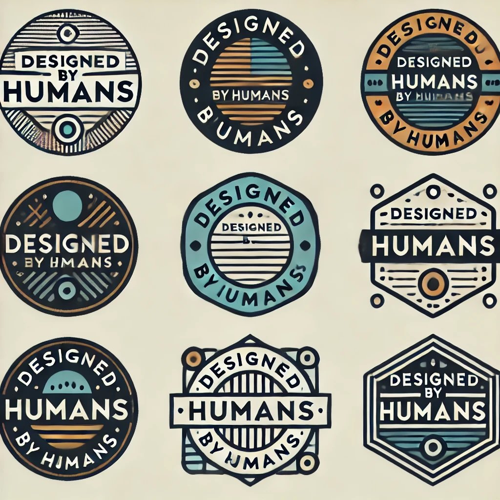
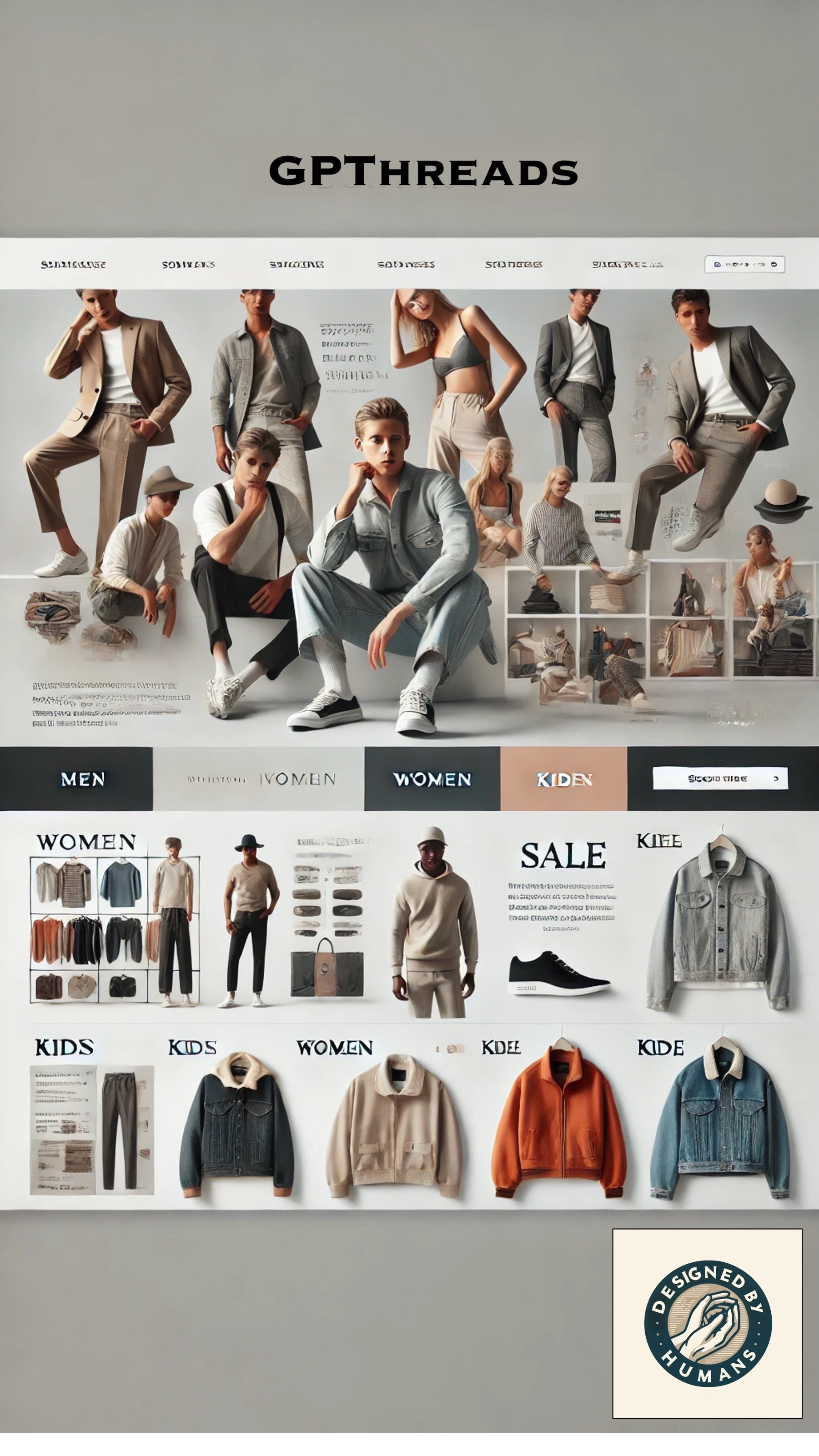
[Designs and typos courtesy of ChatGPT]
To check if the results generalize across badges, I could analyze the data treating badge as random factor, much like we typically treat participant as a random factor. The statistics are a little trickier than a simple ANOVA, but Judd and colleagues explain it in language consumer researchers should be able to follow.
Generalizing isn’t the only problem with shoddy stimulus sampling. Poor stimulus sampling also messes up a study’s internal validity, as explained in this excellent paper. For example, the badge in my experiments included not only the phrase “Designed by Humans,” but also an image of hands, which means that it could have boosted sales because consumers have a hand fetish, not because it says designed by humans. The problem is even easier to see with the Hitler version of the badge, which could decrease sales because consumers dislike Hitler, not because the badge says, “Designed by Humans.”
To fix internal validity, it is better to control for the differences between stimuli in the treatment and control conditions. For instance, I could include a control condition that features a badge that pictures hands but that doesn’t say, “Designed by Humans.”
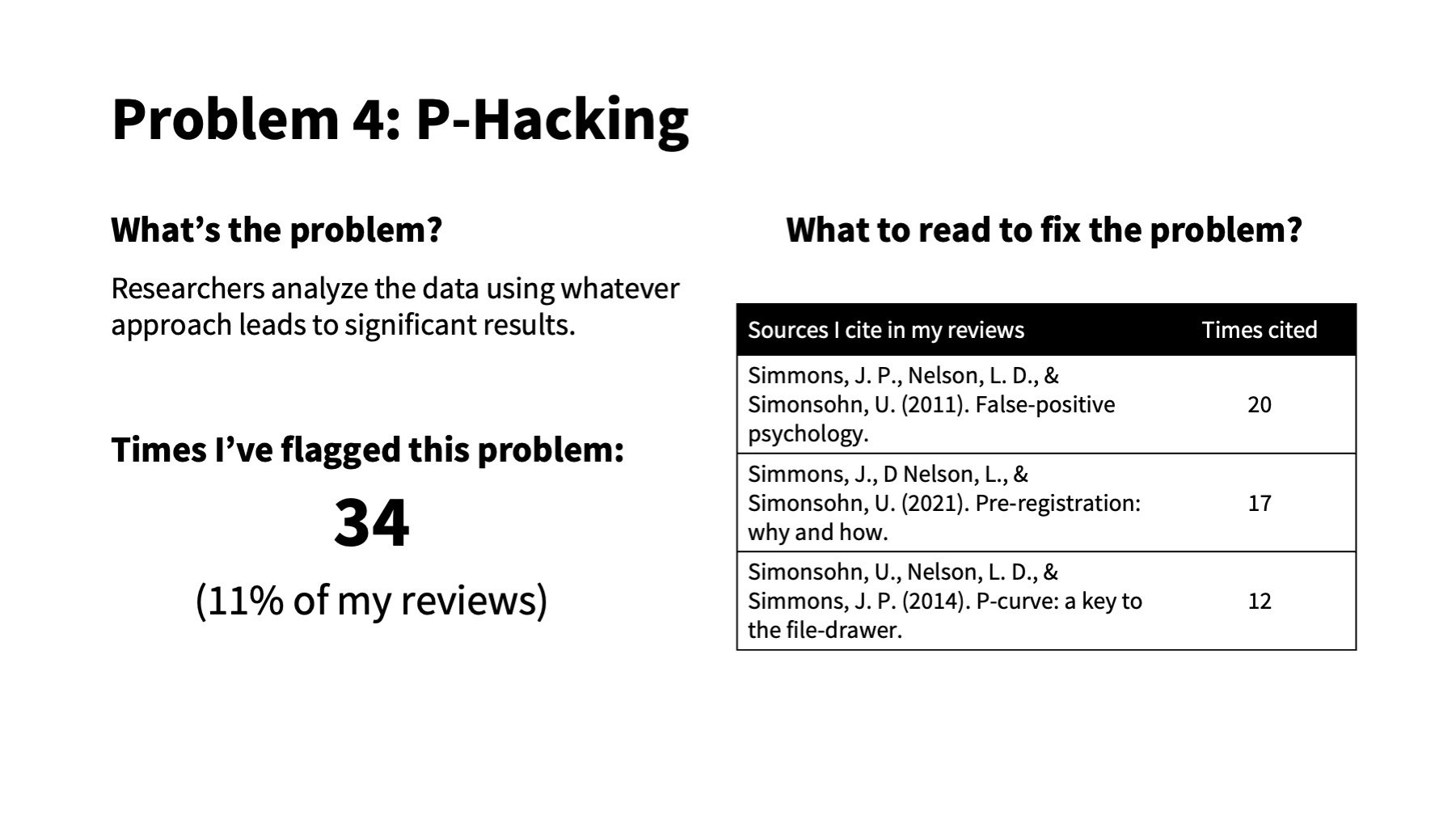
P-hacking refers to when researchers manipulate their data until it says what they want. Imagine if you asked a Magic 8-Ball, “will JCR accept my paper,” and it says “No” (p > .05). But instead of accepting this forecast, you shake the 8-ball until it says, “Heck yes!” (p < .05).
P-hacking is explained exquisitely in academic articles, blog posts, and Last Week Tonight with John Oliver. I’ve written about it before myself, far less exquisitely.
Despite this, I continue to review papers that shake the 8-Ball until p < .05.
How to show you didn’t p-hack
There are at least three ways to show that your research isn’t p-hacked.
One, preregister your studies. Preregistering means that you decide how many times to shake the 8-Ball before looking at the answer and that you commit to reporting this answer, even if it isn’t the one you want to see. It’s okay to report results and analyses that differ from your preregistration, as long as you acknowledge what was not planned and you explain why you switched things up. One of the quickest ways to get reviewers to swipe left on your paper is to report unexpected results or unplanned analyses as if they were predicted in your preregistration.
Two, include direct replications. Showing that your core result replicates in a different sample with the same stimuli, measures, and analyses, increases the chances that it is legit. Direct replications are especially important to ensure that an unexpected result was not a fluke. Thus, if you report a result that is not what you preregistered, you should replicate it in a different sample with the same method and analysis. This time, preregister the new prediction and analytic plan beforehand.
Three, show that most of your p-values are closer to 0 than to .05. If an effect is real, then the distribution of p-values in studies that test it will be skewed towards zero, such that you should find more between 0 and .01 than between .04 and .05. If there is no real effect, then the p-values for studies that test it will be evenly distributed across all p-values, so you should be equally likely to find p-values close to .01 as .04. If most of the p-values in your studies are bunched up just below .05, you’ve probably been shaking the magic 8-ball aggressively. Simonsohn et al. illustrate this in their 2014 paper:
Source: Simonsohn, U., Nelson, L. D., & Simmons, J. P. (2014). P-curve: a key to the file-drawer. Journal of Experimental Psychology: General, 143(2), 534.
I hope that by airing my grievances, I might start to see less of them in the papers I review. Either way, it felt good to vent.
Much thanks to Meg Campbell, Peter McGraw, and Nathan Warren for their feedback on this post and to my band members for tolerating my work-life-imbalance.
Also, Thanks to John Lynch (see the comment) for the insight and additional background and references! Here are the links he references for easier access:

